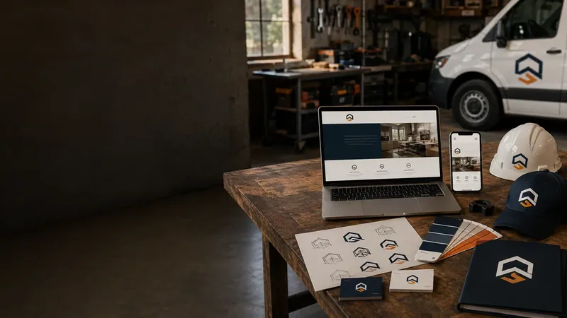
Do I need a logo for my business? It’s one of those questions that feels like it should matter more than it usually does at the start. The honest answer is: probably not yet. A clean, simple wordmark — your business name set in a solid, consistent font — covers most of what a brand-new site needs a logo to do: look intentional, be readable, and not embarrass you.
The short answer
Whether you need a logo for your business or not comes down to one question: where else is it going to appear? If the only place your name shows up is the top of your website, a wordmark handles that fine. Once your name needs to work on a truck door, a yard sign, a shirt, or anywhere it has to be recognized at a glance without being read word by word, that’s when a designed logo starts earning its keep.
People searching “do I need a logo for my business” are usually surprised how often the answer is no, not yet. Plenty of legitimate, established trade businesses run for years on a wordmark alone. Nobody’s turning down a good contractor because his site header is a well-set business name instead of a custom mark. So no, you don’t need a logo for your business on day one — but it’s worth knowing when that changes.
What a wordmark actually is
A wordmark is just your business name set in a distinctive typeface — no icon, no symbol, nothing extra. Think Google, Coca-Cola, FedEx. The letterforms themselves carry the brand. That’s different from a full logo, which usually pairs a symbol with the name (a combination mark) or stands alone as an icon once people already recognize it.
For a business that’s new, or whose name isn’t a household word yet, a wordmark is usually the right call before a symbol is. A symbol on its own only works once people already know what it means — the Nike swoosh means nothing without years of the Nike name behind it first. Skipping straight to an icon-only logo is designing for a recognition you haven’t built yet.
When a wordmark is genuinely enough
If you’re just getting your first real website up, a well-set wordmark does the job. It’s clean, it’s part of the build at no extra cost, and it doesn’t try to be more than it needs to be. It works fine sitting at the top of a webpage, in an email signature, or on a simple invoice.
When it’s worth getting a real logo made
A designed logo starts to earn its keep once you’re using it in more places than just the website header — on a truck, a shirt, a yard sign, business cards, or anywhere it needs to be recognizable at a glance. A wordmark works fine sitting still at the top of a webpage; a logo works better when it needs to be small, moving, or seen from across a parking lot.
- Vehicle signage. A truck door is read for half a second at a stoplight. A tight, simple mark reads faster than a full business name in a wordmark font.
- Apparel and merch. Shirts, hats, and hi-vis vests need something that survives being small, single-color, and stitched or printed at low resolution.
- Signage and yard signs. Same problem as a truck — distance and speed matter more than detail.
- Repeat brand recognition. Once customers are seeing your name across multiple touchpoints — site, truck, cards, a Google Business Profile photo — a consistent mark ties them together instead of looking like three different businesses.
The three logo types, in plain terms
Most of what gets called a “logo” falls into one of three categories, and knowing which one you actually need saves money and back-and-forth:
| Type | What it is | Best fit |
|---|---|---|
| Wordmark | Business name in a distinctive font, no symbol | New or unestablished business |
| Combination mark | A symbol paired with the name | Business ready to put a mark on trucks, shirts, signs |
| Icon / symbol only | A standalone graphic, no words | Only once the name is already well known locally |
A combination mark is usually the sweet spot for a trade business that’s outgrowing a wordmark — it gives you a symbol you can use on its own once people know it, while the full name-plus-symbol version still does the identifying work everywhere else.
Clean-up vs. starting from scratch
Not everyone starts from nothing. If you’ve already got something — even something rough — that changes the math.
A cleaned-up version of a logo you already have is usually the cheaper, faster move if you’ve got something that mostly works but looks dated, low-resolution, or was made in a hurry years ago. A full new design makes more sense if you don’t have anything to start from, or what you’ve got doesn’t represent the business anymore — a logo from a business you’ve since rebranded, or one that was never more than a low-res JPEG someone pulled off a truck wrap years ago.
Mistakes that cost more later
Getting the “do I need a logo for my business” decision wrong in either direction — spending on a mark too early, or never upgrading once you actually need one — is what turns a simple choice into a repeat expense. A few specific mistakes to avoid:
- Skipping straight to an icon-only mark. Without existing recognition, a symbol alone doesn’t communicate anything — it just looks unfinished.
- Designing only for one background. A mark that only works on your brand’s dark blue falls apart the moment it needs to sit on a white invoice or a black t-shirt. It should work in a single flat color first.
- Never getting the source file. A screenshot of your logo, or a JPEG someone sent years ago, isn’t something a print shop or sign shop can resize cleanly. Always get the original vector file, not just a picture of the result.
- Matching the wrong tone to the trade. A playful, rounded typeface reads differently than a solid, no-nonsense one — a electrician and a landscaper shouldn’t necessarily reach for the same look.
Don’t get a logo made because you feel like you’re supposed to. Get one made when you’ve actually got places to put it beyond the website — that’s when it starts paying for itself.
Do I need a logo for my business? Quick answers
Do I need a logo for my business if I only sell online?
Less urgently. If everywhere your name appears is a screen — a website, an Etsy shop, an invoice PDF — a clean wordmark covers it. A logo matters more once physical items enter the picture: packaging, shipping labels, a table banner at a market.
Do I need a logo for my business before I get a website built?
No. A wordmark set as part of the site build covers the launch. Get the site live first, then revisit a logo once you know where else your brand actually needs to show up.
What “done” actually looks like
Whichever route you take, the end result should hand you more than a single image file. A proper logo delivery includes a vector version (so it scales to a truck door or a business card without going blurry), a version that works in solid black for printing, and clear space guidance so nobody crops it wrong on a sign. Adobe’s own explanation of vector versus raster files is a decent plain-language rundown if a print shop or sign maker asks which format you have. If a “logo” you’re handed is just one PNG with no other files behind it, that’s usually a sign it wasn’t built to last past the website.
How we help with this
New logo design — $150. A real designed logo built for your trade, ready to use on the site, on merch, on a truck — wherever you need it.
Clean up an existing logo — $50. If you’ve already got something that mostly works, we can tighten it up and get it into shape for the site instead of starting from scratch.
Make your next first impression a better one.
New websites $697. Redesigns $597. Nothing due up front. Standard hosting is $37 per month separately.
Let’s talk about your website